> ## Documentation Index
> Fetch the complete documentation index at: https://docs.agentmark.co/llms.txt
> Use this file to discover all available pages before exploring further.
# Components
> Create reusable components to share prompting patterns across your prompts
AgentMark supports reusable components so you can keep prompting patterns consistent across your prompts. Create components in the Dashboard or locally as files. In both cases, a component is an `.mdx`/`.md` file you import into your prompts.
## Create a component
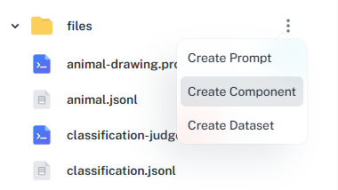 The Create Component dialog prompts for the component name and drops a new `.mdx` file into the selected folder. After you edit and publish it, it's available for import in any prompt on this app.
1. Open the **Files** tab for your app.
2. Click the kebab menu (⋮) next to the folder where the component should live.
3. Select **Create Component**, give it a name, and click **Create**.
4. Edit the component in the visual editor, then click **Publish**.
Create components as `.mdx` or `.md` files in your `agentmark/` directory:
```shell theme={null}
agentmark/
├── components/
│ ├── math-instructions.mdx
│ └── language-instructions.md
└── prompts/
└── example.prompt.mdx
```
Add a new `.mdx` (or `.md`) file under `components/`. The file is picked up on save. If your app is synced to Cloud, the next `git push` makes it available to your deployed handler; in Local mode, `agentmark dev` reads it directly from disk.
## Using components
Import and use components in your prompts:
```jsx example.prompt.mdx theme={null}
import MathInstructions from '../components/math-instructions.mdx';
You are a math tutor.
```
Component example:
```jsx math-instructions.mdx theme={null}
You are a patient and knowledgeable math tutor.
Explain concepts with simple, everyday examples and avoid complex notation.
Use formal notation, theoretical foundations, and rigorous proofs.
```
In the calling prompt, the parent passes `level` as a prop; the component reads it as `props.level`. AgentMark scopes component props to the component, so they don't collide with the parent prompt's props. See [TemplateDX Components](/templatedx/components) for the full reference (props, conditional rendering, plain-markdown imports, and composition).
The Create Component dialog prompts for the component name and drops a new `.mdx` file into the selected folder. After you edit and publish it, it's available for import in any prompt on this app.
1. Open the **Files** tab for your app.
2. Click the kebab menu (⋮) next to the folder where the component should live.
3. Select **Create Component**, give it a name, and click **Create**.
4. Edit the component in the visual editor, then click **Publish**.
Create components as `.mdx` or `.md` files in your `agentmark/` directory:
```shell theme={null}
agentmark/
├── components/
│ ├── math-instructions.mdx
│ └── language-instructions.md
└── prompts/
└── example.prompt.mdx
```
Add a new `.mdx` (or `.md`) file under `components/`. The file is picked up on save. If your app is synced to Cloud, the next `git push` makes it available to your deployed handler; in Local mode, `agentmark dev` reads it directly from disk.
## Using components
Import and use components in your prompts:
```jsx example.prompt.mdx theme={null}
import MathInstructions from '../components/math-instructions.mdx';
You are a math tutor.
```
Component example:
```jsx math-instructions.mdx theme={null}
You are a patient and knowledgeable math tutor.
Explain concepts with simple, everyday examples and avoid complex notation.
Use formal notation, theoretical foundations, and rigorous proofs.
```
In the calling prompt, the parent passes `level` as a prop; the component reads it as `props.level`. AgentMark scopes component props to the component, so they don't collide with the parent prompt's props. See [TemplateDX Components](/templatedx/components) for the full reference (props, conditional rendering, plain-markdown imports, and composition).
Have questions?
Reach out any time: